
Brand Identity Design
A complete logo and brand guideline system for food catering business.
Selected works across branding, digital, and print design
Eliminating visual leaks & securing pricing power.
Recognition speed across modern platforms.
Peace of mind from professional standards.
A complete logo and brand guideline system for food catering business.
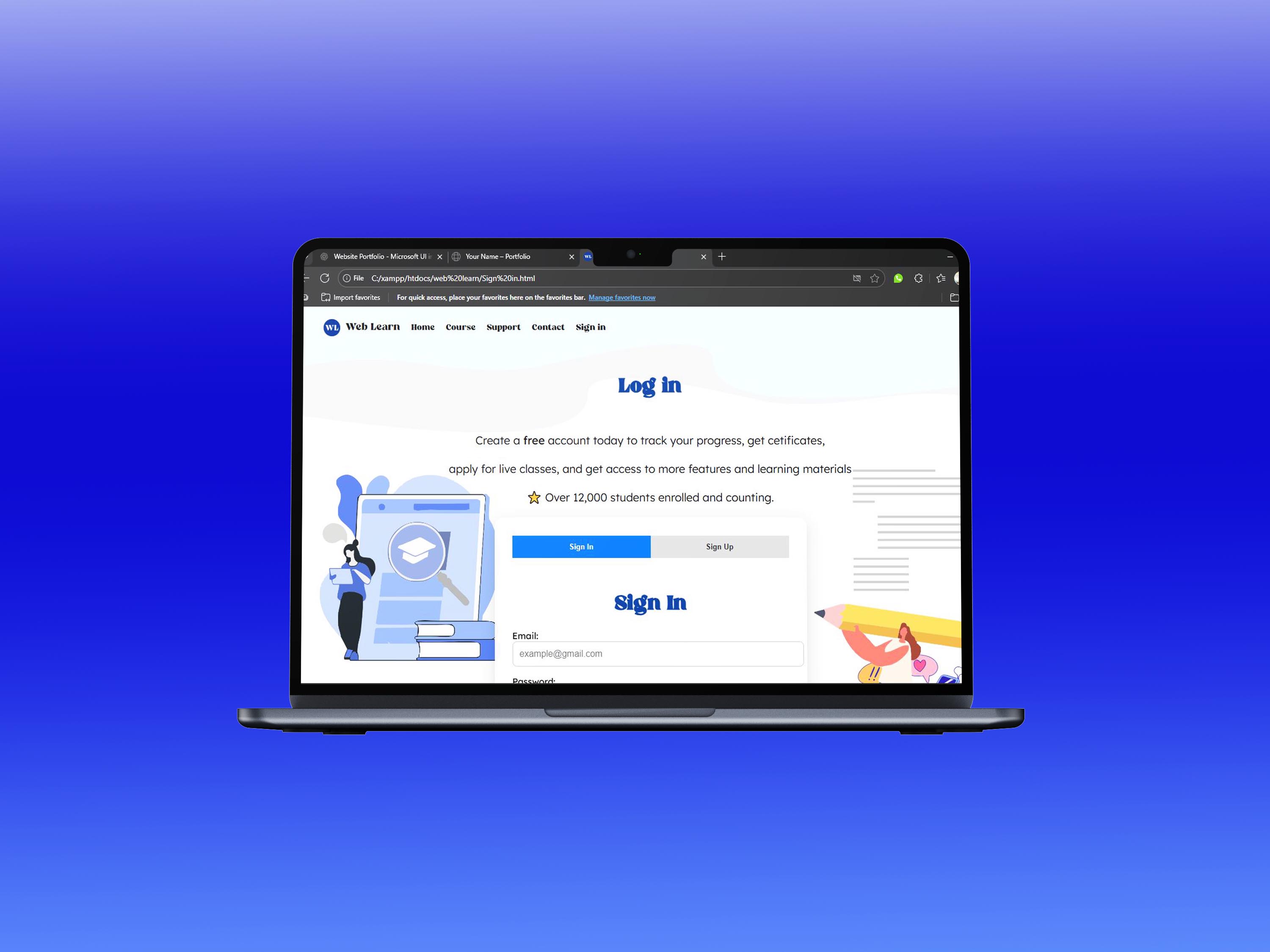
Responsive website built with modern UI principles for education platform.
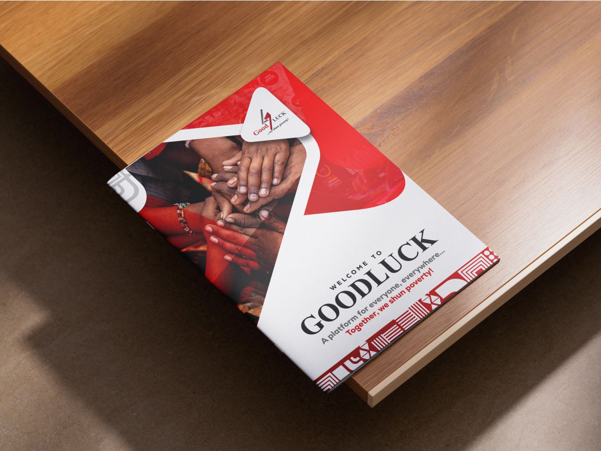
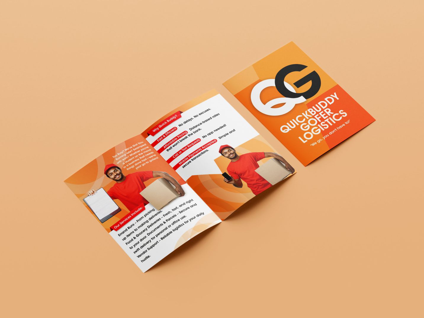
High-quality brochures and business cards for microfinance company.
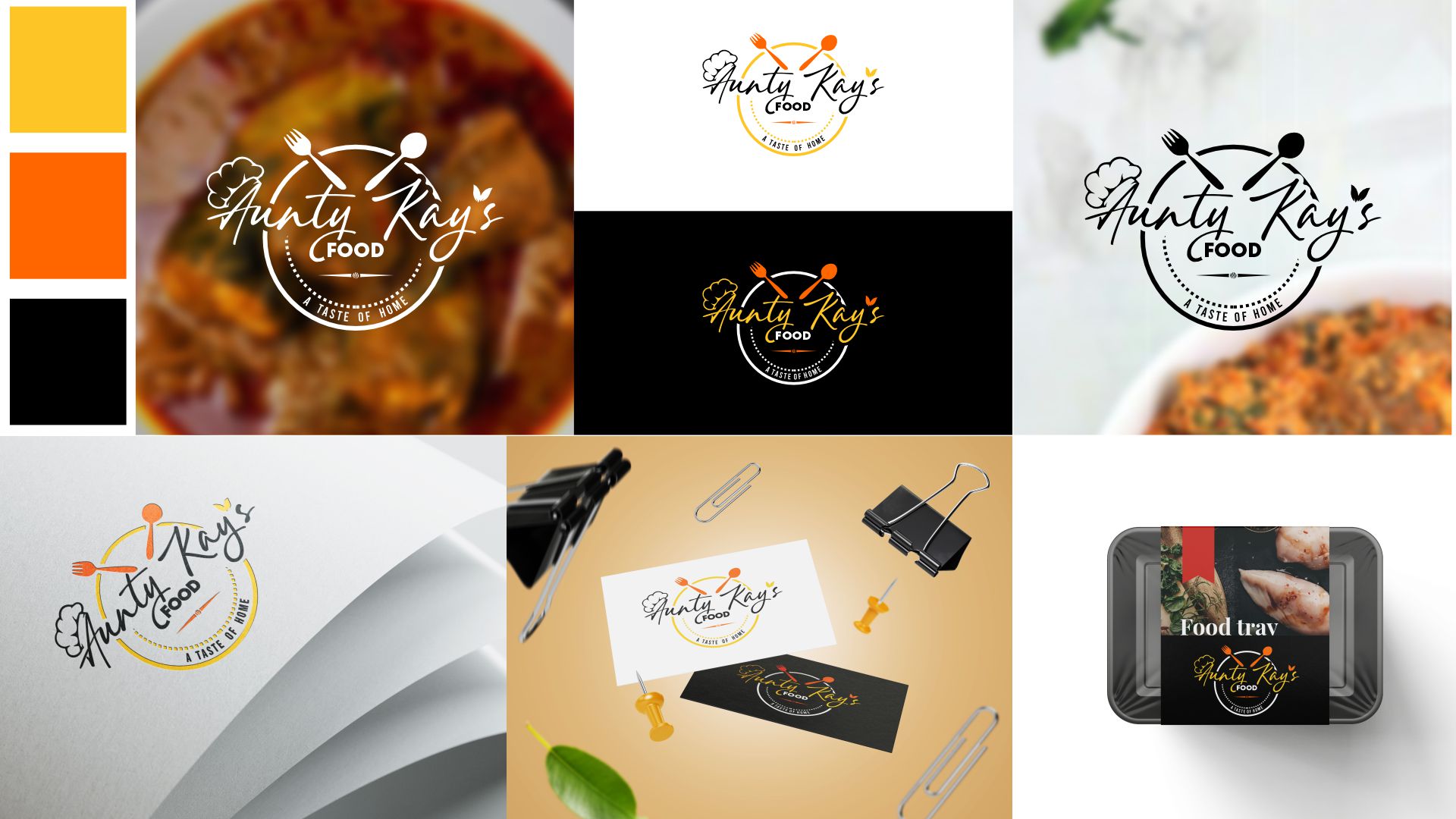
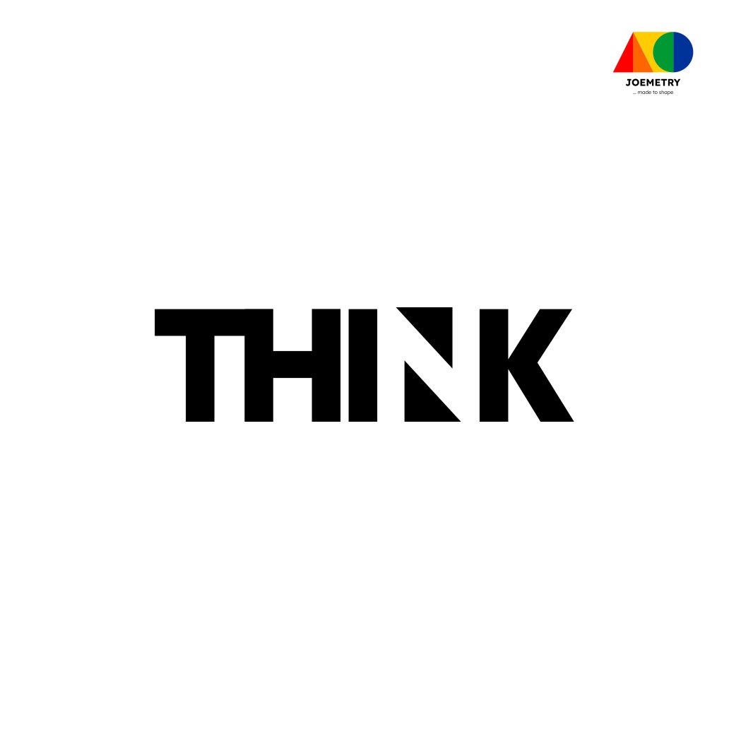
Logo Design & Brand Identity for Catering Business
Comprehensive brand identity redesign for a popular catering service
Aunty's Kay Foods is a catering brand known for delicious meals and a lively, welcoming personality. The client approached us for a rebrand of her existing logo, aiming for something fresh yet instantly recognizable.
She wanted a logo that:
We focused on building a visual identity that balanced fun and professionalism.
The new logo successfully captures the soul of Aunty's Kay Foods: inviting, playful, and trustworthy. It's versatile enough for both digital and print applications, and simple enough to remain memorable. The rebrand positions her business to stand out in a crowded catering market while keeping the warm, home-grown feel her customers love.
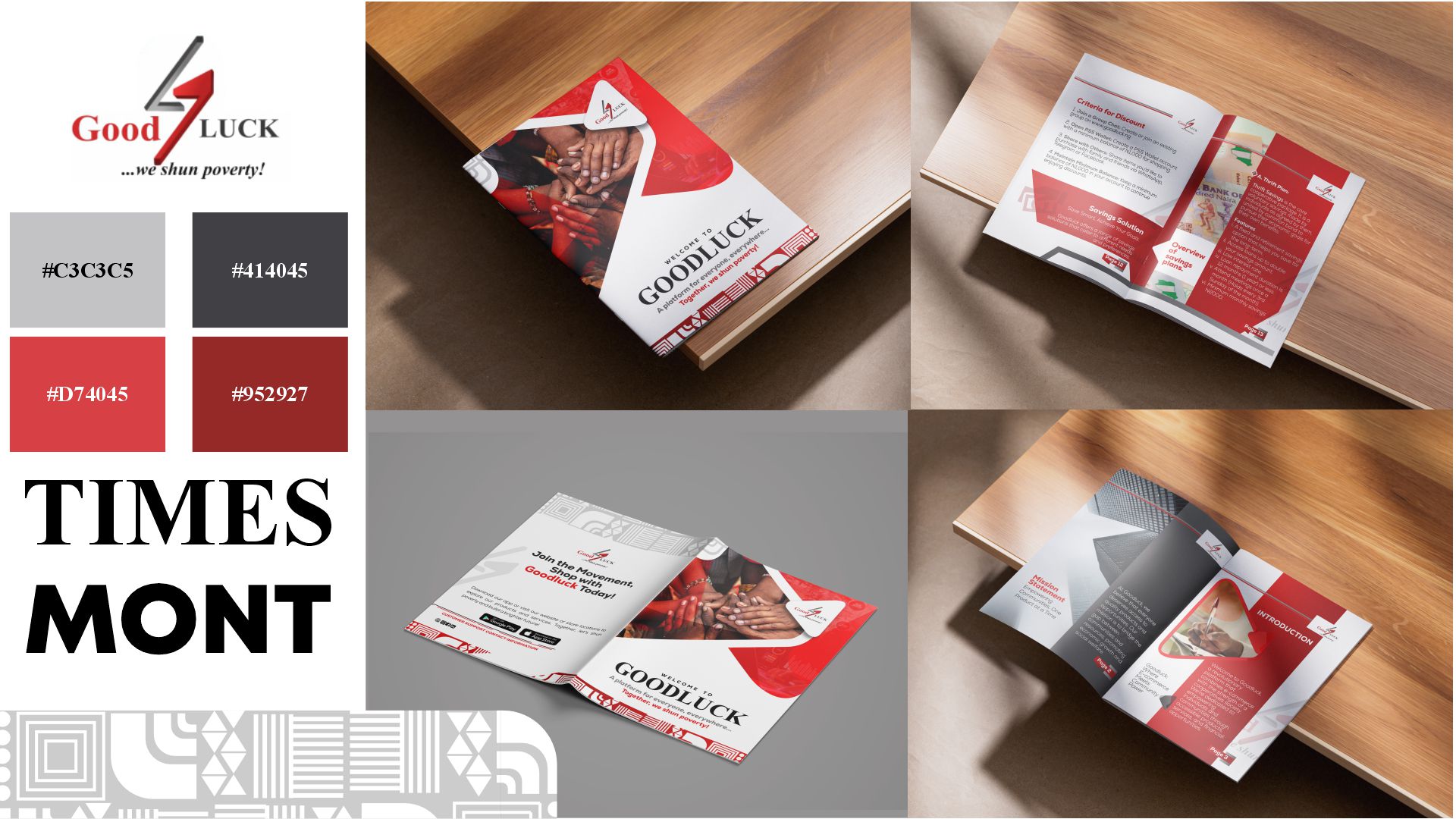
Professional Brochure Design for Microfinance Institution
Brochure Design for a Microfinance & Community Aid Company
The client, a microfinance and community aid organisation, sought a brochure that could effectively communicate its services and mission while maintaining a professional yet approachable tone. Their existing brand identity used red and grey, but the application across previous materials felt inconsistent and sometimes distracting.
From the outset, I advised a slight tweak to the company's logo—not a full redesign, but subtle adjustments to ensure it integrated seamlessly across brochure pages. This allowed the brand colours (red and grey) to be used more cohesively without overpowering the core content.
I narrowed the brochure's typography to two fonts for clarity and balance:
This dual-font strategy created a strong visual hierarchy while staying aligned with the company's values.
The design incorporated two primary images with gradient overlays in red and grey, used as background and section dividers. The gradients added depth while reinforcing the brand colours in a subtle, non-distracting manner.
To keep focus on the company's core message, I reduced clutter, avoided unnecessary decorative elements, and kept the overall layout clean. This made the brochure reader-friendly and ensured the agenda of community support and financial clarity remained central.
The final brochure delivered consistent application of the red and grey palette without distraction, a strong typographic hierarchy that conveyed trust and readability, visual harmony between logo, colours, and content, and clear presentation of prices, services, and community outcomes.
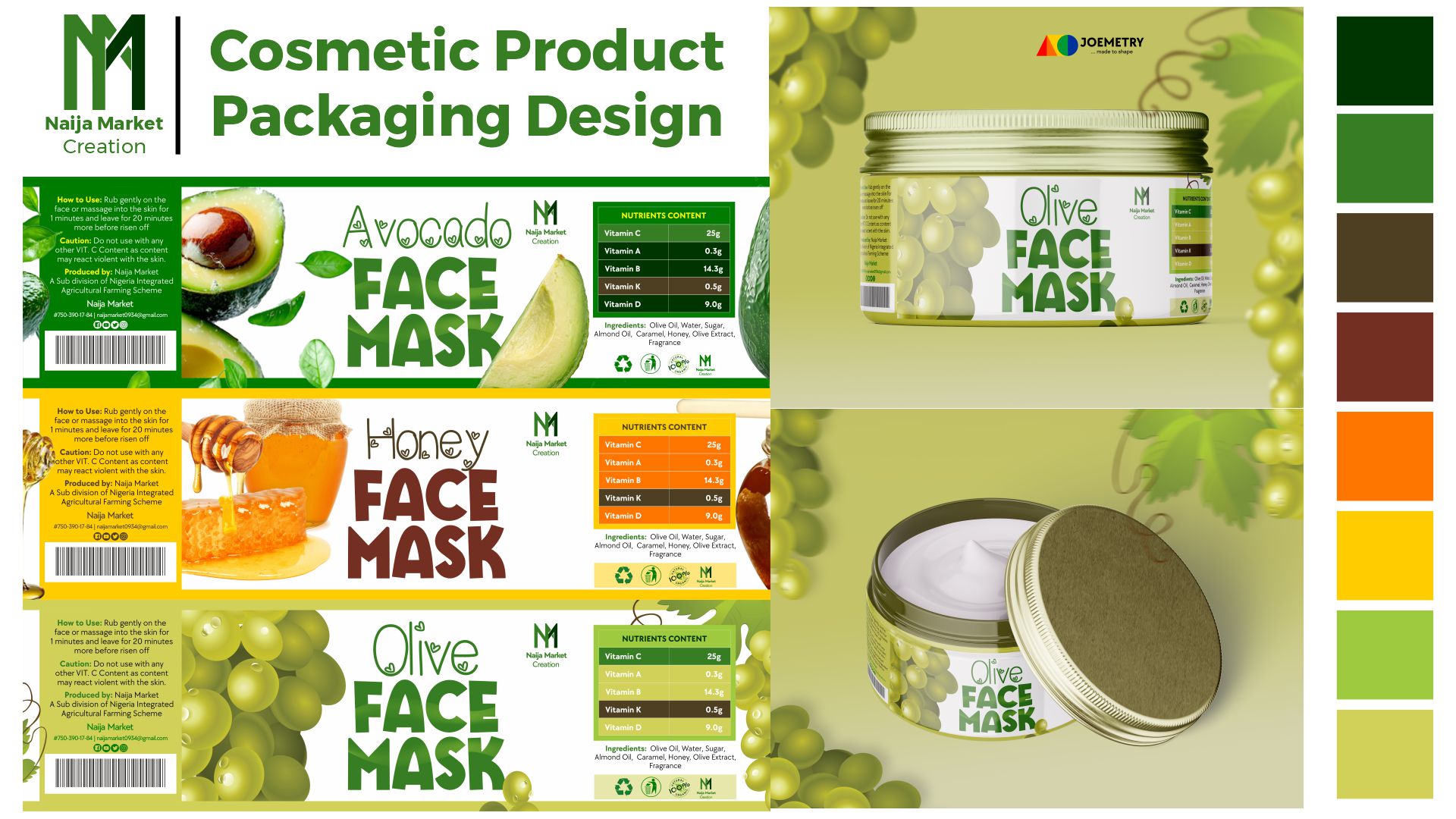
Product Packaging Design for Agricultural Market
Comprehensive packaging design system for agricultural products
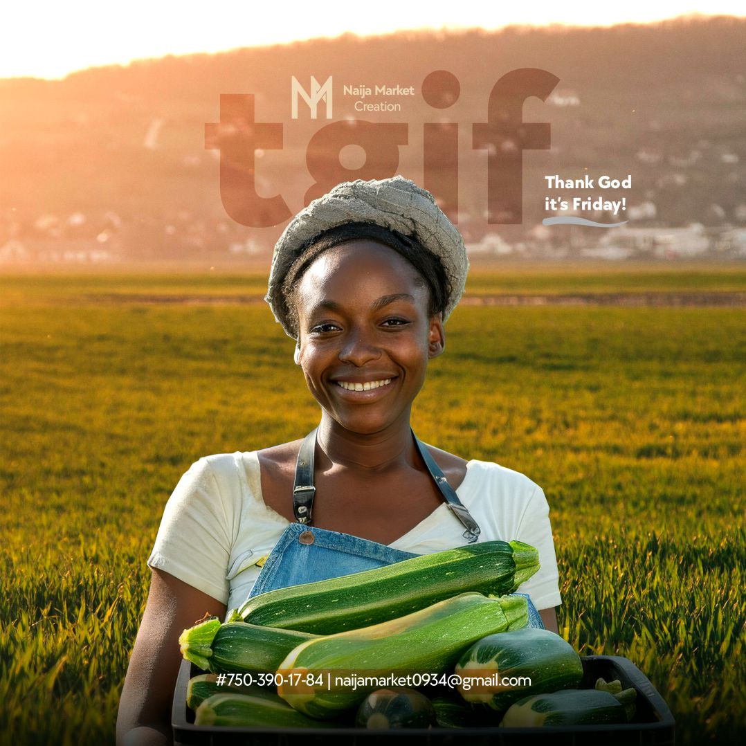
Naija Creation, an emerging agricultural market player, wanted to launch a product line covering avocado oil, honey, and olive-based face cream. As a new entrant in a crowded space, their main challenge was to design packaging that stood out on shelves, reflected authenticity and freshness, and could remain timeless as the company grew.
I proposed a colour-coded packaging strategy where each product would have its own visual identity while maintaining a unified brand feel:
Created a distinctive packaging system that allowed each product to shine individually while remaining recognisably "Naija Creation" as a family brand. Achieved a timeless look that avoids trends, giving the brand longevity in a competitive market.
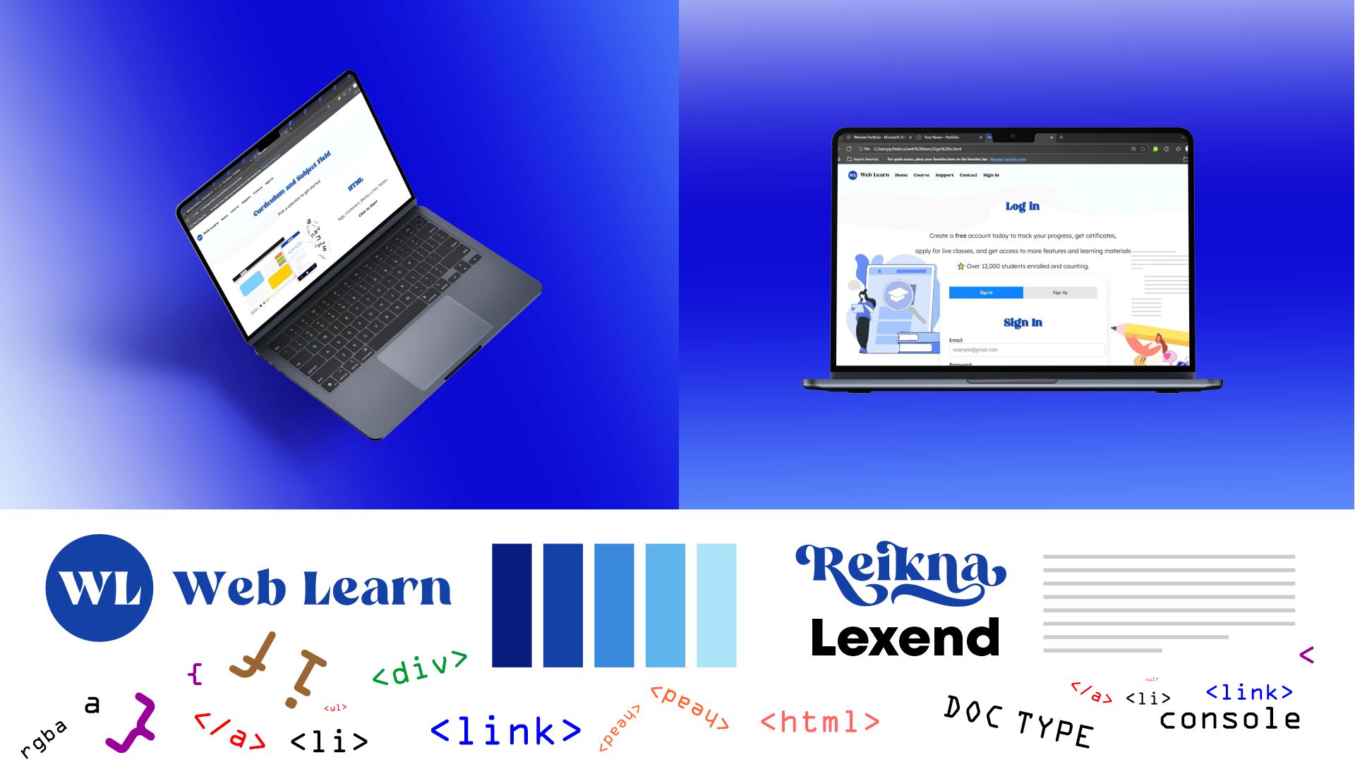
Responsive Web Design for Programming Education
Web Learn is a self-initiated test project designed to teach students and beginners the fundamentals of programming. The platform covers topics ranging from HTML, CSS, JavaScript, and advanced tools such as XAMPP, Live Server, and Django.
Colour Palette: Blue & White spectrum ranging from light, sky, baby, dark, deep, royal, and navy tones. Blue tones are universally associated with trust, calmness, and intelligence, creating a safe and focused environment for learning.